Bionee Organic Maternity Skincare Branding
For Bionee, a certified organic maternity skincare line, I undertook a comprehensive branding initiative to create a logo that embodied the essence of motherhood, nature, and purity. Guided by six core brand attributes—natural, organic, feminine, baby, pure, and refreshing—I explored over 60 logo concepts to distill the brand’s identity into a single, resonant symbol.
Design Insight and Inspiration
The design process was enriched by a study of 100 participants’ perceptions, ensuring the final logo connected with Bionee’s target audience. The chosen design—a lotus flower—emerged as a timeless symbol of compassion, purity, and regeneration. Each petal tells a unique story:
Motherhood: The lotus, reaching toward the golden sun, mirrors the fulfillment and beauty of becoming a mother.
Pregnancy: The soft petals represent the purity and anticipation of pregnancy, celebrating its transformative journey.
Baby: The budding lotus encapsulates the innocence and promise of new life, a symbol of hope and beginnings.
Outcome
The final logo encapsulates Bionee’s mission to support women through the journey of motherhood with natural, organic skincare solutions. It weaves a narrative of birth, growth, and renewal—core values that resonate deeply with the brand’s audience.
This project exemplifies the power of thoughtful design to convey a brand’s essence, crafting a visual identity that is both meaningful and timeless.


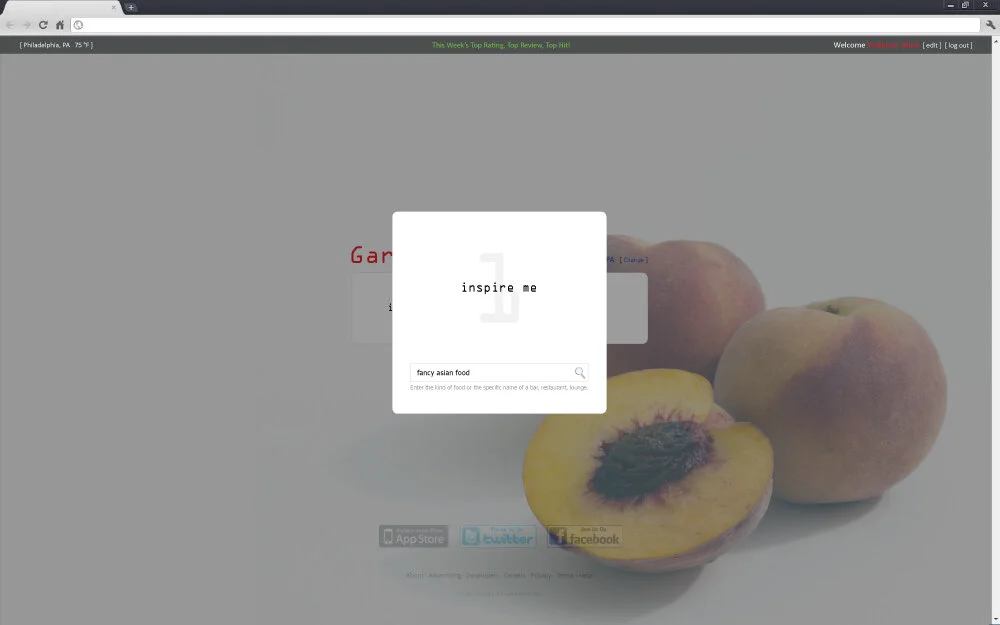
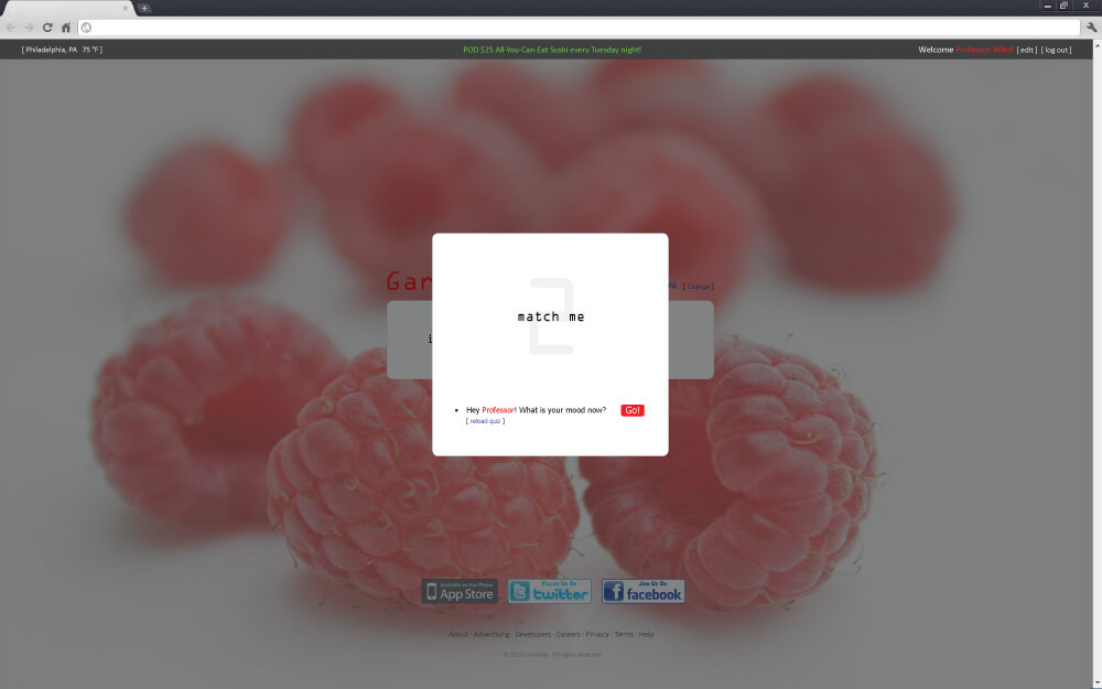
Restaurant Search Engine Study: Garnish
Garnish is a visionary personalized recommendation engine designed to transform how users discover restaurants, bars, and clubs. Unlike traditional platforms, Garnish prioritizes personalization by adapting to users' unique preferences, moods, and dietary needs. Our mission is to deliver a seamless and tailored dining discovery experience, eliminating the hassle of generic editor lists and best-rated establishments.
My Contributions
As a key member of the development team, I played an integral role in shaping Garnish’s innovative user interface and experience. My responsibilities included:
UI/UX Design: Created user interface concepts, detailed sketches, and mockups to enhance the platform’s usability and appeal.
Graphic Design: Designed graphics and flash introduction animations to bring the platform’s branding to life.
Strategic Development: Contributed to the business plan and concept refinement through interdisciplinary collaboration and creative problem-solving.
Creative Problem-Solving Techniques Utilized:
Scenario Planning & Environmental Trends Analysis
Focus Group Interviews & Competitive Product Analysis
Morphological Analysis, Mind Mapping, and Concept Fans
Role-Playing & Observation-Based Insights
Challenging Business Assumptions to Foster Innovation
Collaboration
This project was developed in partnership with Wharton MBA students Ashley Blackmon and Mariel Ilardi (original concept developers), Christelle Kheir, and Sophia Umar. I was responsible for designing graphics, user interactions, website mockups, and flash animations, bringing the platform’s vision to life.
Outcome
Garnish exemplifies how interdisciplinary collaboration and innovative design can redefine user experiences. By combining personalization with cutting-edge design, the platform empowers users to discover dining options curated exclusively for them.
Mentor: Jerry (Yoram) Wind